Why this matters?
Local playlists/recommendations based on city
As Resident Advisor puts it, “local scenes are at […] music’s core” and promoting local artists, regardless of their fanbase size, could pave the way for those unheard of songs.
Below maps demonstrate how recent releases could be classified by genres and displayed on a map in a fashionably manner. Users could explore and get a feel of what local scenes generally look like in present time, and get a sense of what the sound of the city looks like.
By looking at different streaming platforms, it could be argued that they somewhat differ on some of the music they promote. I have been comparing top genres from recent releases on Spotify API and Discogs API and was able to find difference in not only the genres, but also the artists themselves.
Comparing different music platforms gives us an idea on what type of market they are targeting, which could in part facilitate branding campaigns and promoting specific artists to the platform.
Comparing data from different platforms
Limitations
Other projects
AI Visual Inspection Tool for Quality Control in Assembly Lines
Further research
Transformed by setting up a predifined list of genres
categories = ["pop", "electro", "hip hop", "rap", "rock", "alternative", "house", "r&b"]
Spotify API classifies genres for artists and not for each track individually, making the genre labels somewhat less significant. In addition, new releases could not be given a specific timeframe, thus what we have above for Spotify is a small sample of the more famous songs. Nevertheless it could give a decent explanations as to how different the styles, or even the markets of Discogs and Spotify are.
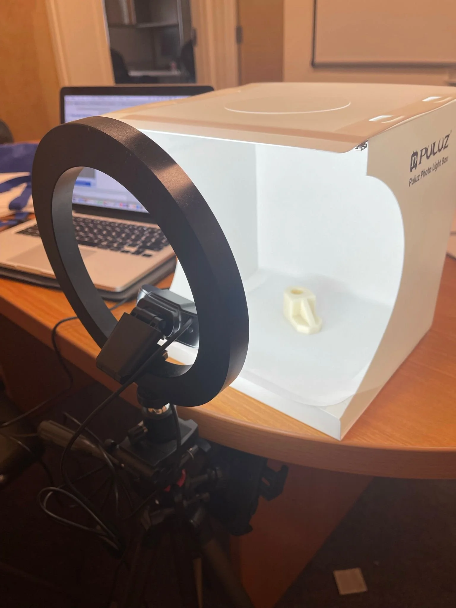
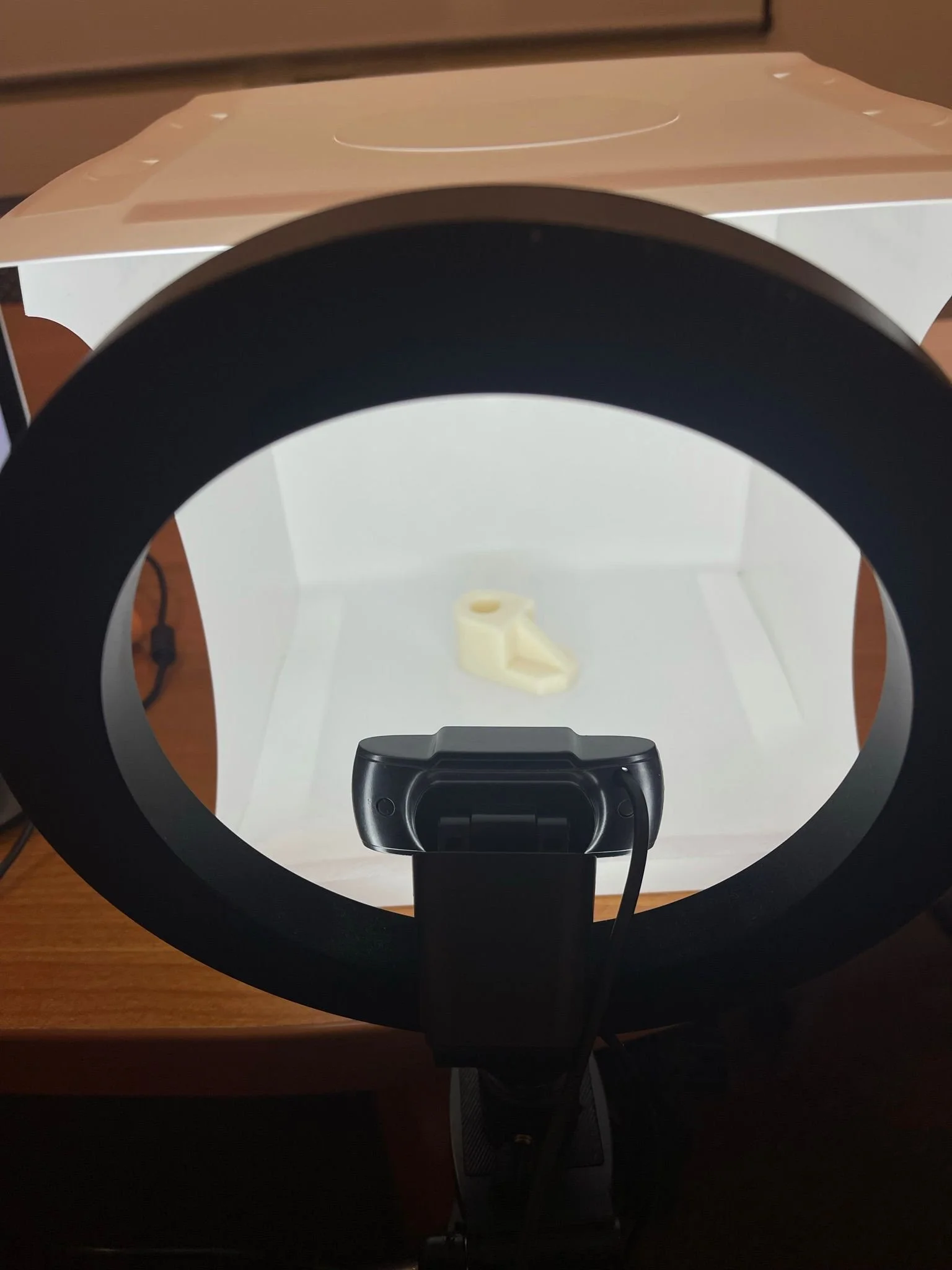
Along with my team and a research professor at Northeastern University, we are currently developing an AI Visual Inspection Tool for Quality Control in Assembly Lines. This camera is currently being trained to detect 3D printed parts that are defects and parts that are non-defects. The training is based on the concept of domain randomization, where synthetic pictures of the 3D printed parts are created on NVIDIA ISAAC SIM, a software that runs on Linux only and that generates random colors, orientations, background colors, brightness of light and many other parameters that can be modified to expose the camera to any scenario possible for the recognition of defect and non-defect parts. In parallel, real world images of the 3D printed parts are taken and then uploaded to the training model, which allows us to asses the strength of the model created. The goal of the project is to provide a proof of concept for the industry that could potentially use this method to achieve Industry 4.0 standards in a fully automated future.
The volume of music in today’s world is overwhelming, and the need to organize and structure all this information has never seemed more crucial. The internet facilitates the access to consumer data or artist data, and with a couple of API tweaks, valuable insight could be projected.
I believe that there is an opportunity to utilize the tools at our disposal to better study the market, get a consensus on what the sounds of today are and build an identity for our future. Since everything is so scattered throughout the internet, analyzing that information to understand what music lovers and artists want could create some unity and cohesion.
It is difficult to associate data and programming to music, since music is an art form that cannot be quantified and is based on sensations and emotions. Nevertheless, in our digital world, the power of information should be used to our advantage create opportunities and fill in gaps to support both artists and users.
Correlation between music styles and weather/climate
Enhancing tools for A&R like Meddling to look at other metrics, instead of only focusing on number of followers
Studying the sounds of urban spaces (MONYC by NYU students)
Explanation
This data is pulled from Last.fm API using top tracks of countries that I specified in this case. Then, the genre is pulled from the artist, who is given a specific genre on this API, and the results are stored in a data frame to navigate through Plotly in an easier way.
None of the APIs provide city data, thus the geographic locations of the bubbles are not represented of the actual top genres/artists in given cities, but rather the top genres/artists of the country.
The data used here is based on top tracks in a country, not latest releases. For formatting and simplification, this type of data was utilized as a prototype for the idea of displaying top tracks on a map.
Limitations
Explanation
This data is pulled from Discogs API and Spotify API. For discogs, the genres are given to each track release, then a specific timeframe could be set. Once that is set up, then the number of occurrences of each genre is calculated to result in a pie chart.
With Spotify, the genre classifications are much more granular (as seen in table below), so the genres were simplified before they could be displayed on a pie chart. Genres were simplified with a simple for loop to go through each row in table then match it with predefined genres.


